Trying to catch up with my second botanical drawing course, after the fact–twigs! Amazing variety. Look, observe, respect, admire.

Trying to catch up with my second botanical drawing course, after the fact–twigs! Amazing variety. Look, observe, respect, admire.
I just started teaching a course in art history–1750 (Neoclassicism) to the present. I’ve taught genres within art history–women’s art, environmental/ecoart–but never a survey. It’s a challenge, but I am really enjoying it. I’ve been reclaiming my artistic roots (drawing, painting, collage, printmaking), and this is one more venue for doing so. My approach to the course is to frame the work and art periods by the social, political, environmental, and technological context of the time period–how were artists influenced by the times in which they lived?
I recently came across a fascinating series of books titled “Very Short Introductions” by Oxford University Press. These “very short introductions,” which can fit in a pocket and are not more than 100 pages or so, cover a wide range of topics. I am currently reading A Very Short Introduction: Art History. I had thought when I purchased it, that this would be an introductory survey. But I was pleasantly surprised that it is, in fact, a discussion of the discipline of art history.
What I am discovering is that my contextual approach to art history is a fairly recent development in the field. The author, Dana Arnold, is well schooled in feminist, postmodern, and post colonial theory and applies it. I am certainly familiar with the critique in Linda Nochlin’s 1988 essay “Why Have There Been No Great Women Artists,” which deconstructs the traditional art historical privileging of white, Western, male, genius artists. This Very Short Introduction explains why that has been the case, and it goes back to the very first writings on art by Vasari (1511-74), who was greatly influenced by Pliny the Elder (CE24-79). Vasari, following in Pliny’s footsteps, emphasized individual artists and their masterpieces, creating an art historical cannon that remained largely unchallenged until the 20th century!
Why do I find this fascinating? This Very Short Introduction charts the trajectory of how art has been valued over the centuries, which has largely been based on the ancient Roman standards of one man, and then subsequently reinforced by another man from the Renaissance. In both cases, these men rarely had the original art to study, relying on written descriptions and prints.
Despite recent post-modern challenges to “the cannon,” it continues to dominate how art is evaluated. Though women, artists of color, and (less so) collaborative groups have been “allowed” into the cannon, the cult of the lone “genius” artist and his/her masterworks remain the standard by which artists and their works are judged.
Well, I am half-way through the Introduction, so more on this later. But, definitely worth pondering!
In June, I spent a week in Chincoteague, Virginia with daily visits to Asseteague National Wildlife Refuge. Rather than my usual approach to travel watercolors, in which I attempt some precision and realism, I went for more impressionistic and gestural. I enjoyed doing these (other than being devoured by mosquitos) and felt that I had gained more confidence and control after taking the botanical illustration classes. I paid much more attention to the values (lights and darks) to suggest the forms and depth. I started with watercolor pencils and then added water to “melt” the pencil. Then I enhanced the images with watercolors.


I had the background for this third Marking Time collage done for some time, but the half circle was not coming together. I tried a few things that did not work. Then I tried photocopying some leaves along with the water quality chart, and here’s the result. I’m wondering if this is too pretty and decorative, not enough of an edge, which I think the other two pieces have. I like it none the less and now I want to do more.

I’ve held on to this circular chart that I found in an abandoned sewage treatment facility. It was used to monitor the chlorine in the water. Putting that use aside, I was attracted to the form, the marking of time, the charting or monitoring of the water. I knew I would want to use it at some point, so here, eight years later, it is finding its way into these collages. I’m experimenting with image transfer techniques, materials and color. I like the idea of monitoring and charting, which could be a theme using various types of charts.

I recently put these up on a wall in my bedroom so I could live with them for a while. The arrangement on the wall demands that I do one more to complete a triptych. I realized that the two above represent two of the four elements: water and fire. I’ve used the four elements periodically in my work, and I was surprised that they surfaced again, completely subconsciously! These also echo the theme of the Watermark panels (see post below): the impact of industry and environmental degradation equally on humans and animals. I like how the figures on the left swim like fish and how the birds on the right are oblivious to the train in the distance. I will do another of these on the element of earth.
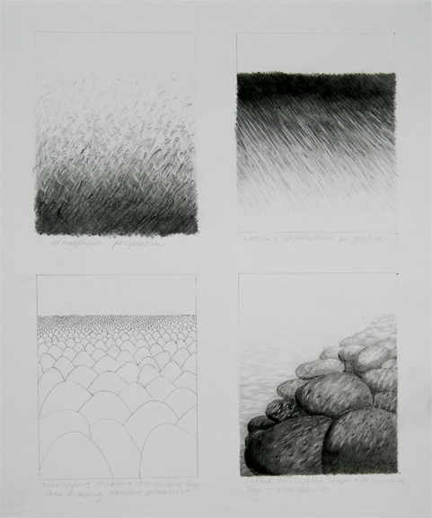
As part of my return to my artistic roots, I’ve wanted to go back to the basics and learn skills I never fully acquired or relearn what I might have forgotten. The technical aspects of drawing have never been my strong suit, and I think part of the reason is that the subjects, being largely human-made and geometric, never inspired me. I’ve always loved organic shapes and lines–the forms of fruit, vegetables, leaves, flowers, and the lines of bare trees in winter. So when I saw a class offered in botanical illustration, it seemed like it would be perfect for my needs and interests. The first class in a series, which is almost finished, has been as basic as you can get: gray scales, atmospheric perspective, texture, shading basic shapes, and shadows. Here’s one page of atmospheric perspective, using texture fading to a horizon line, overlapping shapes diminishing in size, and combining these for the last in the lower right quadrant.

The work is challenging, sometimes tedious, and I am thoroughly enjoying it! I am looking forward to the next class when we will actually get into drawing plant forms and using color! I really want to get back to some of my other projects, such as the deep mapping and a half-finished Japanese woodblock print, but this class has consumed me over the last month.
Our last project in the course was a still life. We didn’t have time to complete it in class. I’ve finally finished it (below). I can now see how all the prior exercises in the course (gray scales, texture, and shading/light in particular) are essential to creating a realistic end result. Not perfect, but I am pleased with this!

I’ve taken the summer to reclaim my roots in painting, drawing, collage and printmaking. I am enjoying this immensely, meandering through whatever processes and content have called to me on any given day. I recently assigned my concept development students the task of deep mapping the ocean (they are to pick a topic within this very large subject), so I decided to take on my own assignment!

There’s many, many topics that have concerned me for some time in regard to ‘The Ocean’: acidification (A Sea Change), plastic (Bag It), the BP oil spill, loss of coastal wetlands (Katrina), noise pollution (National Geographic), dead zones (Carleton College), coral bleaching and destruction, and the safety of seafood (David Suzuki), to name a few. I assigned my students to fill up 10 pages with images, text excerpts, maps, diagrams, information, etc. I followed suit, beginning with going through my stack of National Geographic Magazines. Almost every issue includes an article on the ocean–an excellent starting point!
I came around to a pile of clippings I had saved from the BP ‘Spill,’ which was paradigm shifting for me. I have always believed that social and environmental change was a slow process, and if I could reach even a few people with my artwork, writing or teaching, that would add up to something. The Spill made me seriously question my assumption. If one company, through negligence and greed, can destabilize a vast ecosystem and a region’s livelihood, how can I think that getting a student or two to recycle is effecting any kind of change? The gulf between an individual and a wreckless multinational corporation is unfathomable. I doubt that I will ever be able to hold on to such naive hope again.
A focus for my “deep map” began to form: the Gulf as a microcosm of the rich diversity of human and non-human life that is imperiled by our choices. Coincidentally, to back up my premise, I happened on a program last night on Katrina (anniversary: August 23, 2005). One of the interviewees said that the Gulf region is the “canary in the coal mine.”
So I have begun with my visual research, experimenting with both content and techniques. Here’s a few pages. More to come.

For some months now, I’ve been thinking about a project that would visually chart my creative history in parallel with defining events in world history and art that have been important to me. It would look something like three parallel visual time lines: one my own work over some 30 years, historic events, and contemporary art history. The task has seemed overwhelming, especially the thought of cataloging 30 years of work, though by some accounts, I am fairly organized. It dawned on me that one way to begin this is just simply to use index cards, which I have in great abundance and in several colors, and note each of my projects on a card. I do not intend to catalog everything, rather mostly projects and works, often collaborative, that have demanded significant time, research and thought.
I have been working on my indexing for a few weeks now, and here are a few visuals of my efforts. Each decade is a different color. Unlike a resume of exhibitions, this accounting is project based. I am excited to see my efforts before me, concisely laid out in visual form. It will be interesting to add the other two parallel time lines, whenever I get to that part. This will be an ongoing project for some time, which I want to then organize into notebooks, each project with its digital files and various paperwork, all in one place, eventually leading to self-publishing a catalog or two.

")
I am pleased to be in a third exhibition in Pittsburgh of artist books, curated by art and drama librarian Mo Dawley, on the theme of the environment and water, in conjunction with Too Shallow for Diving (see my previous post). The exhibit is at the Hunt Library (4th floor) at Carnegie Mellon University. Requiem is an artist book that I produced in 1998 while a graduate student at Carnegie Mellon.
Requiem is a lament for the earth. I photographed the images at a wetland area on the Kitsap Peninsula in Washington State, near Bremerton. Wetlands have intrigued me for many years. Long thought to be wastelands of little value, often drained and destroyed, they are nature’s nurseries, teeming with life. These places, where land and water meet, act as sponges, filtering toxins and buffering our coasts. I have paired this serene landscape with excerpts from an ancient poem, “The Thunder: Perfect Mind,” discovered in 1945 among the Gnostic Manuscripts at Nag Hammadi, a city in Upper Egypt. The source and intent of the poem is a mystery, though the voice is a female deity who speaks in paradoxes or riddles. I believe this poem could represent the voice of the earth or Gaia, who asks in one verse: Why do you curse me and honor me?
The following are the digital images only. The actual book is printed on vellum in one long strip, 20″ x 180″, accordion fold. These images also don’t show the text, which is written longhand, in pencil across the bottom of the piece.
In addition to the above work at the Hunt Library, are three smaller books, two produced as a project of the Community Trail Art Initiative and one produced by myself and Steffi Domike–a postcard pack of images from our project River Vernacular. In total, these three exhibitions span 13 years of my work, all on environmental themes, and largely focused on water. The Hunt Library show is a rich compilation of approaches and media in artist book forms on the environment. Well worth a visit!
The second exhibition I am participating in is Too Shallow for Diving: The 21st Century is Treading Water , curated by artist and educator Carolyn Speranza for the The American Jewish Museum of the Jewish Community Center of Greater Pittsburgh. As their site describes, the exhibition explores the environment, especially those issues surrounding water and its impact on our planet, human health and public welfare… All of the artists address issues of water in their art, investigating its aesthetic qualities, its function as a source of food, its life giving essence, its cycles, climate change and its scarcity and contamination.”
In collaboration with Steffi Domike, Watermark is comprised of four panels that, as a whole, represent a concise timeline of energy resources: wood, coal, oil, and natural gas. Each of these extractive processes and their impact on water, animals, and humans is considered through a photo montage contained in the silhouette of a bass (wood), an eagle (coal/mountaintop mining), turtles (oil), and a child (natural gas/fracking). The silhouettes are roughly the same size, suggesting that whether human or animal, large or small, our bodies are vulnerable to the abuses we ravage upon the lands and waters that support all life.
We took all the photos near Pittsburgh, except for the aerial view of the mountaintop mining site in West Virginia (photo credit: Les Stone, Corbis News Collection ). The point of view of the images suggests how that creature might view the landscape: fish/water level, bird/aerial view, turtles/ground level, child/vista of farmland. The panels, each 60″ x 30″ were composed digitally and printed on canvas. We then distressed the backgrounds using water, which removed some of the ink, creating a sense of water drops and spray, and using latex paint leaving trace prints of plastic lids and foam tubes–a subtle suggestion of what might be floating in the water. The individual images above are the digital versions only. The installation shot shows the panels with the altered backgrounds.

